

Histogram
Histograms serve a pivotal role in e-commerce parametrized filtering by visually representing the distribution of product attributes, enabling customers to adjust their search criteria efficiently. They facilitate a more interactive and precise filtering experience, allowing users to modify the range of properties like price or size based on actual item availability.
There are actually only a few use cases in e-commerce websites where histograms are used. The most common is the price histogram, which is used to filter products by price. You can see an example of such a histogram on the Booking.com website:
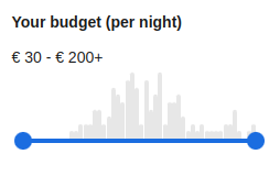 Booking.com price histogram filter
It's a shame that the histogram isn't used more often, because it's a very useful tool for gaining insight into the distribution of product attributes with high cardinality values such as weight, height, width and so on.
The histogram data structure is optimized for frontend rendering. It contains the following fields:
- min - the minimum value of the attribute in the current filter context
- max - the maximum value of the attribute in the current filter context
- overallCount - the number of elements whose attribute value falls into any of the buckets (it's basically a sum of all bucket occurrences)
- buckets - an sorted array of buckets, each of which contains the following fields:
- threshold - the minimum value of the attribute in the bucket, the maximum value is the threshold of the next bucket (or max for the last bucket)
- occurrences - the number of elements whose attribute value falls into the bucket
- relativeFrequency - a value used for visualizing bucket height in UI (0-100 scale):
- For standard histograms: percentage of total occurrences, calculated as (occurrences / overallCount) * 100
- For equalized histograms: normalized value density that considers both occurrences and bucket width:
- Raw frequency is calculated as occurrences * (totalRange / bucketWidth) - this rewards buckets with many occurrences packed into narrow ranges
- Values are then normalized to sum to 100 across all buckets
- Empty buckets always have relativeFrequency = 0
- requested:
- contains true if the query didn't contain any attributeBetween or priceBetween constraints
- contains true if the query contained attributeBetween or priceBetween constraint for particular attribute / price and the bucket threshold lies within the range (inclusive) of the constraint
- contains false otherwise
Attribute histogram
- argument:int!
the number of columns (buckets) in the histogram; number should be chosen so that the histogram fits well into the available space on the screen
- argument:enum(STANDARD|OPTIMIZED|EQUALIZED|EQUALIZED_OPTIMIZED)
The behavior of the histogram calculation:
- STANDARD (default): Returns exactly the requested number of buckets with equal-width intervals across the value range.
- OPTIMIZED: Returns fewer buckets when data is sparse to avoid large gaps (empty buckets).
- EQUALIZED: Returns exactly the requested number of buckets, but positions bucket boundaries based on cumulative frequency distribution so each bucket covers approximately equal portion of total records. This provides better user experience when data is heavily skewed.
- EQUALIZED_OPTIMIZED: Combines EQUALIZED bucketing with optimization to reduce empty buckets.
- argument:string+
- one or more names of the entity attribute whose values will be used to generate the histograms
To demonstrate the use of the histogram, we will use the following example:
The simplified result looks like this:
The histogram result in JSON format is a bit more verbose, but it's still quite readable:
Attribute histogram contents optimization
To demonstrate the optimization of the histogram, we will use the following example:
The simplified result looks like this:
The optimized histogram result in JSON format is a bit more verbose, but it's still quite readable:
As you can see, the number of buckets has been adjusted to fit the data, contrary to the default behavior.
Attribute histogram equalization
Standard histograms use equal-width buckets across the entire value range. This works well for uniformly distributed data but can be problematic when data is heavily skewed. For example, if 90% of products have width between 10-50 cm and only 10% have width between 50-500 cm, equal-width buckets would cram most products into the first few buckets while leaving many empty buckets in the upper range.
- Calculates the total weight (sum of all record counts)
- Calculates cumulative frequency for each unique value
- Positions bucket boundaries at points where cumulative frequency crosses threshold (i/bucketCount)
- Counts actual occurrences in each resulting bucket
To demonstrate equalized histogram, we will use the following example:
The simplified result looks like this:
The equalized histogram result in JSON format is a bit more verbose, but it's still quite readable:
As you can see, unlike standard histograms where bucket widths are equal, equalized histograms adjust bucket widths to distribute records more evenly. This makes the histogram more useful for filtering when data has a skewed distribution.
Price histogram
- argument:int!
the number of columns (buckets) in the histogram; number should be chosen so that the histogram fits well into the available space on the screen
- argument:enum(STANDARD|OPTIMIZED|EQUALIZED|EQUALIZED_OPTIMIZED)
The behavior of the histogram calculation:
- STANDARD (default): Returns exactly the requested number of buckets with equal-width intervals across the value range.
- OPTIMIZED: Returns fewer buckets when data is sparse to avoid large gaps (empty buckets).
- EQUALIZED: Returns exactly the requested number of buckets, but positions bucket boundaries based on cumulative frequency distribution so each bucket covers approximately equal portion of total records. This provides better user experience when data is heavily skewed.
- EQUALIZED_OPTIMIZED: Combines EQUALIZED bucketing with optimization to reduce empty buckets.
To demonstrate the use of the histogram, we will use the following example:
The simplified result looks like this:
The histogram result in JSON format is a bit more verbose, but it's still quite readable:
Price histogram contents optimization
To demonstrate the optimization of the histogram, we will use the following example:
The simplified result looks like this:
The optimized histogram result in JSON format is a bit more verbose, but it's still quite readable:
As you can see, the number of buckets has been adjusted to fit the data, contrary to the default behavior.
Price histogram equalization
Just as with attribute histograms, standard price histograms use equal-width buckets which can be problematic for skewed price distributions. For example, in a marketplace where most items cost $10-$50 but a few luxury items cost $500-$5000, equal-width buckets would waste slider space on the expensive (but sparse) end.
To demonstrate equalized price histogram, we will use the following example:
The simplified result looks like this:
The equalized histogram result in JSON format is a bit more verbose, but it's still quite readable:
As you can see, the bucket boundaries are positioned to distribute products more evenly across the slider range.
Baseline relaxation — sliders don't contract under their own handles
How evitaDB applies the relaxation
- Attribute range sliders — attributeBetween and histogramHaving. These drive attribute histograms, both on plain entity attributes and on reference-level histograms.
- Facet selections — facetHaving. These drive the facet summary and its impact calculations.
- Price range — priceBetween. This drives the price histogram.
Worked example
| Self-computation | What the baseline hides | What the baseline keeps applied |
|---|---|---|
| height histogram | every attribute range slider — attributeBetween("height", …) and every other attributeBetween or histogramHaving in the same userFilter | facetHaving("brand", …), priceBetween(100, 500) |
| width histogram | the same — every attribute range slider is peeled for any attribute histogram in the query | facetHaving("brand", …), priceBetween(100, 500) |
| facet impact for other brands | every facetHaving selection | attributeBetween("height", …), priceBetween(100, 500) |
| price histogram | priceBetween(100, 500) | facetHaving("brand", …), attributeBetween("height", …) |
Recommended range carriers
| Slider lives on … | Recommended userFilter child |
|---|---|
| a plain entity attribute (Product.width, Product.height, …) | attributeBetween |
| a reference-level histogram (e.g. parameterValues.height on Product) | histogramHaving — the first-class carrier for reference histograms; also disambiguates between multiple histograms on the same reference |
| the price for sale | priceBetween |
| a facet selection | facetHaving |